Ridley Mortgages
Ridley Mortgages
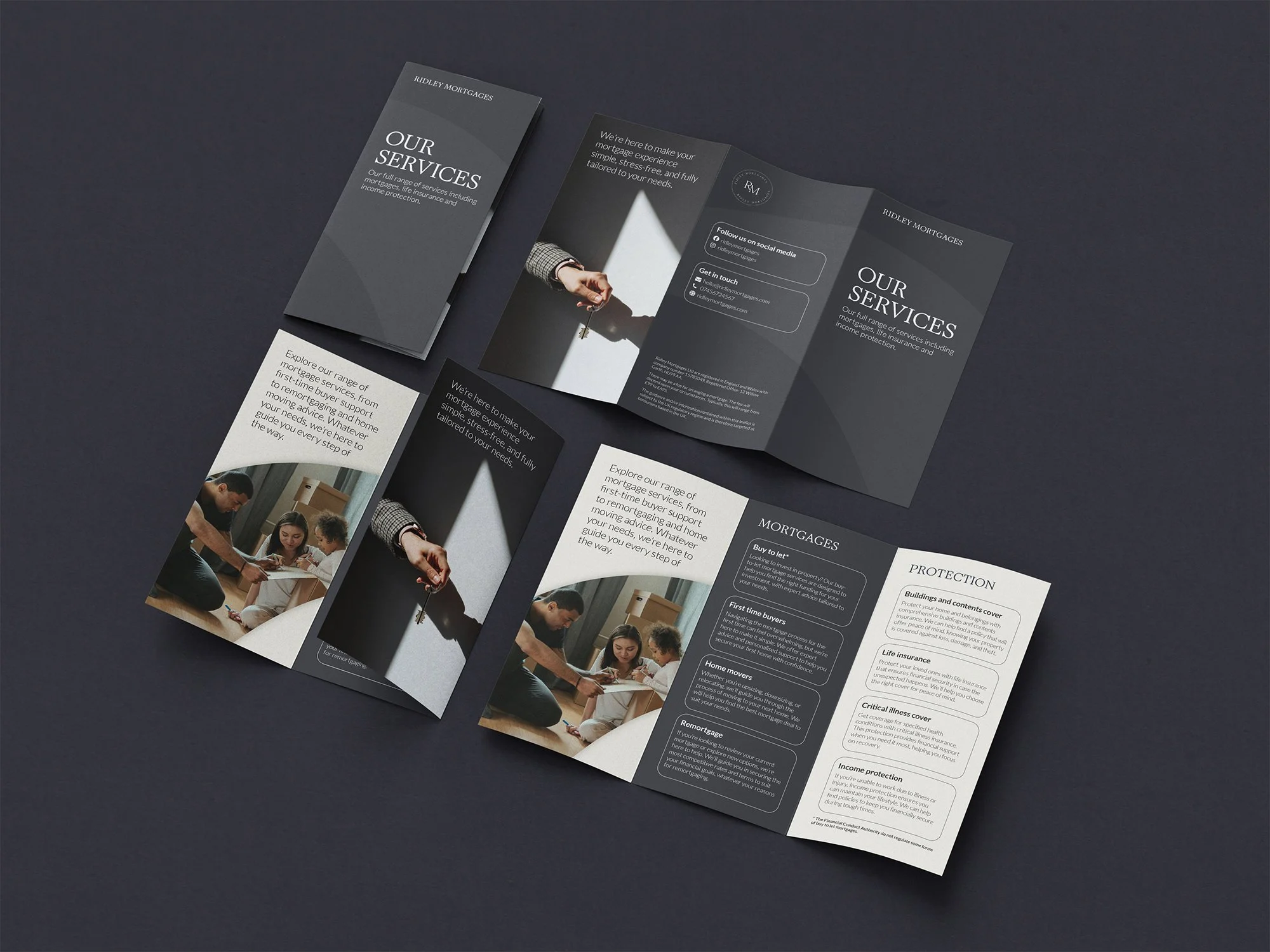
Brand identity for mortgage broker
We developed a modern, professional brand identity for Ridley Mortgages, a broker looking to stand out from the competition while maintaining a sense of trust and corporate credibility.
A serif typeface paired with the charcoal led palette provided a professional foundation, while soft, earthy accent tones added approachability and warmth. Subtle graphic motifs, such as the curve derived from the wordmark, were carried across all materials, tying the brand together consistently.
Deliverables included business stationery, branded merchandise, and a small, clean website designed to clearly showcase their services and help them compete locally.